At this time of year, blue is a colour we hear mentioned a lot in the media but usually for all the wrong reasons. At Nicola Harding & Co and NiX, we thought we'd turn "Blue Monday" on its head, and use it as an opportunity to celebrate what is one of our favourite colours. Read on to find out why blue makes us happy and how you can expertly integrate it into your own space.
How to decorate with blue
Exuding calmness, tranquillity and peace, blue is a colour that takes a starring role in many of our projects thanks to its versatility and depth. “Colour is like a very cost-effective magic spell that transforms the atmosphere of a space and blue is one of my most frequently used ingredients,” says Nix. “From a punchy peacock to an inky indigo, when used correctly it creates a soothing atmosphere and a sense of ease.”
In colour psychology, dark blues are said to be more mentally stimulating helping to aid concentration and creativity while light blues can help calm the mind. For this reason, dark blues are ideal for smaller spaces such as studies, a small bedroom, a bathroom or cosy reading nook, while lighter blues create an excellent backdrop for a large kitchen or living room.

When selecting a shade and tone for an interior, we carefully consider the light levels in a space and what time of day the room is likely to be in use. For spaces used largely in the daytime where the light is bright, we opt for paler colours that will enhance the sense of space. For rooms used in the evening or in areas where light levels are low, we choose richer tones that will give a sense of warmth and drama.
Lastly, we always carefully consider the colour palette as a whole. We don’t look at colours in isolation, always in combination. “There are no ‘wrong’ shades of blue,” explains Nix. “It’s all about what you pair it with; it has to complement the things around it."
"Blue works wonderfully when combined with warm tones of wood and pink hues but don’t shy away from pairing it with cooler colours," she continues. "For instance, they say that blue and green should never be seen but personally, I think it’s a great combination that’s said to support relaxation and restfulness due to its prominence in nature.”

Blue in action
Below is a showcase of just some of our favourite “blue moments” that we’ve created in our residential projects.
Jacobean Manor House
The ceiling of the dining room in our Jacobean House project is wrapped in Farrow & Ball’s ‘Hague Blue’, which brings the dark wood panelling to life. “Blue and brown are an electric combination,” Nix told Elfreda Pownall when the project was featured in House & Garden magazine.
Elsewhere in this project, we paired uplifting sky blue walls painted in Paint & Paper Library’s ‘Constantia Blue’ with cabinetry in Farrow & Ball’s ‘Crimson Red’ and a sofa in Soane’s ‘Dianthus Chintz’, which picks up on the walls.

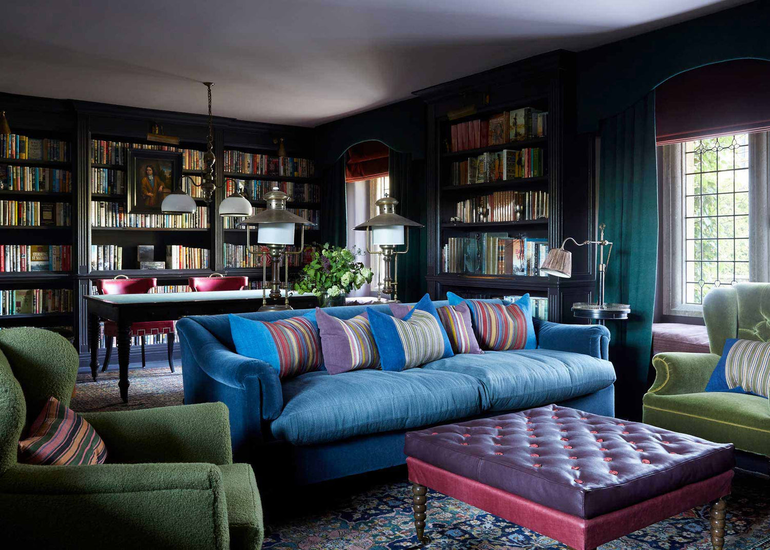
In the library, a sofa with peacock blue velvet upholstery takes centre stage. “We chose a dusty bruised plum colour for the walls, layered it with plenty of textiles and filled it with books, adding magical lighting, so it went from being depressing and underwhelming to atmospheric and exciting,” Nix told House & Garden.
In one of the bedrooms, cornflour blue is used in bold blocks on cabinetry and textiles as an accent colour. This pairs beautifully with the room’s pretty palette of rose pink and fresh spring green.

Somerset Place, Bath
We created a cosy family snug on the lower ground floor of this Grade I-listed Georgian townhouse in Bath by wrapping the walls in Farrow & Ball's ‘Tanner’s Brown’ and painting the ceiling in 'Stone Blue' to bounce light and lift the room.
A dark, cold space off a half landing became a sumptuous family bathroom with rich tones of Farrow & Ball's 'Hague Blue' on the woodwork, which appears almost black and provides clever contrast with artworks, plants and the aquamarine underside of a generous, reclaimed bathtub.

The large hallway, which previously felt too cold and echoey, is wrapped in ‘Squid Ink’ by Paint & Paper Library. "I always paint the space with the lowest light level in a dark colour and this shade of blue really pulls it all in," says Nix.
We used the same ‘Squid Ink’ colour to create an immersive blue space in the small pantry. The Plain English units painted in Paint & Paper Library's ‘Blue Gum’ with black basalt worktops complete the effect.

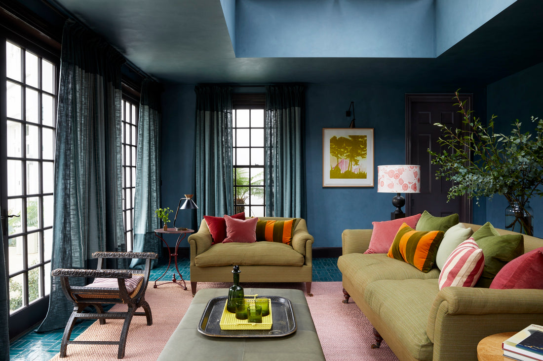
Country House, Berkshire
The dining room's walls, ceiling and woodwork in our Berkshire Townhouse project are drenched in our favourite 'Stone Blue' by Farrow & Ball, which contrasts perfectly with the glossy antique green cabinet. Both colours are picked up in the abstract painting by Brighton artist John Goodison tying everything together. The result is inviting and intimate.
The blue and green colour proportions are reversed in the adjoining entrance hall where Paint & Paper Library’s zingy ‘Chelsea Green II’ is used on the walls and a striking blue velvet sofa and curtain provides the contrasting accent.

In the light-filled sitting room, the blue and green theme continues. This time with linen and velvet upholstery in jewel-toned blues and greens, including Vanderhurd's ‘Cordoba’ linen on the vintage armchairs.
The joinery in the boot room is painted in Farrow & Ball’s ‘Claydon Blue’ which blends seamlessly with the walls, which are ‘Oval Room Blue’.
Upstairs, a bright, serene bathroom is painted in two colours from Paint & Paper Library: ‘Sobek’ on the walls and ‘Samphire’ on the vanity unit and bath.